CSS Flexbox



The Flexible Box Layout Module makes it easier to design a flexible responsive layout structure without using float or positioning.
CSS flexbox layout allows you to easily format HTML. Flexbox makes it simple to align items vertically and horizontally using rows and columns. Items will “flex” to different sizes to fill the space. It makes responsive design easier.
Since flexbox is a whole module and not a single property, it involves a lot of things including its whole set of properties. Some of them are meant to be set on the container (parent element, known as “flex container”) whereas the others are meant to be set on the children (said “flex items”).
Display Flex:-
A div element defaults to display:block. An element with this display setting takes up the full width of the line it is on. Here is an example of four-word divs in a parent div with the default display setting:

display:blockTo use a flexbox on a section of your page, first, convert the parent container to a flex container by adding display: flex; to the CSS of the parent container. This will initialize this container as a flex container and apply some default flex properties.

display:flexFlex Direction:-
The default arrangement after applying display: flex is for the items to be arranged along the main axis from left to right.
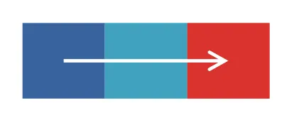
flex-direction allows you to control how the items in the container display. when flex-direction: column is added to the container element.

when flex-direction:- row-reverse is added to the container element.

row-reversewhen flex-direction:- column-reverse is added to the container element.

column-reverseJustify Content:-
Aligns flex items along the main axis. The most common options used to justify-content: flex-start | flex-end | center | space-between | space-around.justify-content is a property to align items in the container along the main axis. This changes depending on how content is displayed. It allows us to fill any empty space on rows and define how we want to ‘justify’ it.
flex-start(default): items are packed toward the start of the flex-direction.

flex-start(default)center:items are centered along the line.

flex-end: items are packed toward the end of the flex-direction.
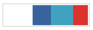
space-between: items are evenly distributed in the line; the first item is on the start line, the last item on the end line.

space-betweenspace-around: items are evenly distributed in the line with equal space around them. Note that visually the spaces aren’t equal, since all the items have equal space on both sides. The first item will have one unit of space against the container edge, but two units of space between the next item because that next item has its own spacing that applies.
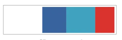
space-aroundAlign Items:-
This allows content to be positioned in many different ways using justify-content and align-items together.align-items allows us to align items along the cross axis. The most common options used to align-items: flex-start | flex-end | center | baseline | stretch.For stretch to work how you would expect, the height of the elements must be set to auto instead of a specific height.
stretch: Stretch to fill the container.

stretch(default)flex-start: Items are placed at the start of the cross axis. The difference between these is subtle and is about respecting theflex-directionrules or thewriting-moderules.

flex-end: items are placed at the end of the cross axis. The difference again is subtle and is about respectingflex-directionrules vs.writing-moderules.

flex-endcenter: items are centered in the cross-axis

baseline: items are aligned such as their baselines align
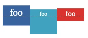
Flex Wrap:-
Controls whether flex items can layout on multiple lines and which direction new lines are stacked in. default value is flex-wrap: nowrap. This will cause everything to stay in one row from left to right. Flexbox by default will try to fit all elements into one row. We can change this with the flex-wrap property. There are three values you can use to determine when elements go to another row.
flex-wrap: nowrap:-This will cause everything to stay in one row from left to right.
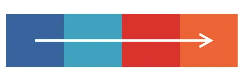
flex-wrap: nowrap(default)flex-wrap: wrap:-This will allow items to pop to the next row if there is not enough room on the first row. The items will be displayed from left to right.
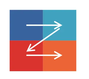

flex-wrap: wrap(for column)flex-wrap: wrap-reversealso allows items to pop to the next row but this time the items are displayed from right to left.